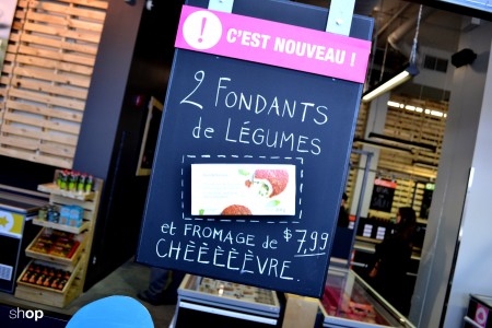
Marché Atwater, Montréal.
A proper identity
As an answer to the needs of Cool&Simple and ensure an optimal consumers experience, SHOP though about and worked on a customer lap with some discoveries, along which the products are highlighted thanks to a merchandising allowing them to express their full potential.
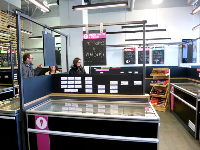
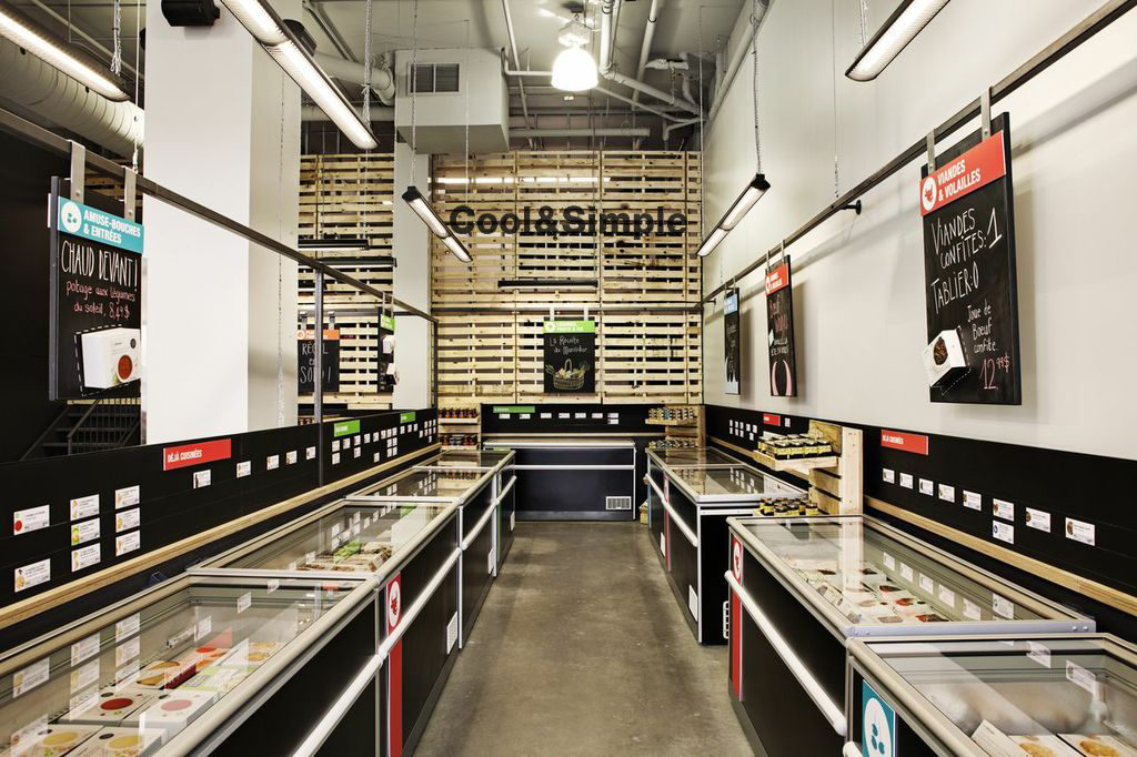
Customers follow then a drawn way french garden style (that means airy), along sober and elegant fridges, punctuated with dry food as complementary products, which fosters a visual break and which invites to cross sales.
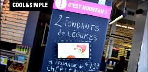
Among the fridges, some slates are skillfully distributed, in a way they can communicate the complementary product offer, and in a way they can catch the eye, thanks to their studied color code and the playful side of their messages, handwritten to allow a more direct dialogue.
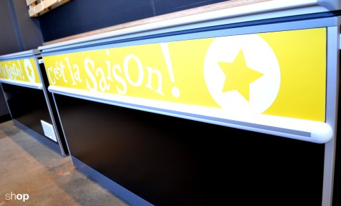
Simple pictograms, which use the color code, are also present on the fridges, still to simplify the research of products and to allow an efficient and pleasant shopping experience.
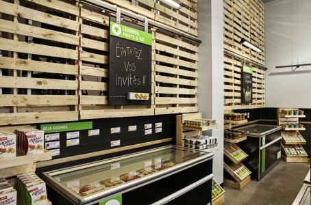
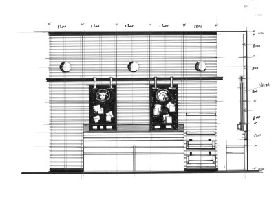
To avoid the coldness effect from the products in the fridges, wooden pallets have been hoisted on the walls and furniture built with the same raw materials, which reminds a marketplace, has been drawn and conceived in collaboration with Protech construction in order to personalize the space and give the shop some design and warm cachet.
These different elements could then be used in the present shops and the ones to come (which was specifically asked by our client).
Thanks to that, Cool&Simple offers a space where merchandising is focused on the product values, which they hope will create a new development for frozen food.
It is how we wish, at the SHOP agency, work on the product environment to highlight it.
You can watch below the concept video:
Find others articles from the identity category here
